
Category
Consumo Masivo, Design, DiseñoAbout This Project
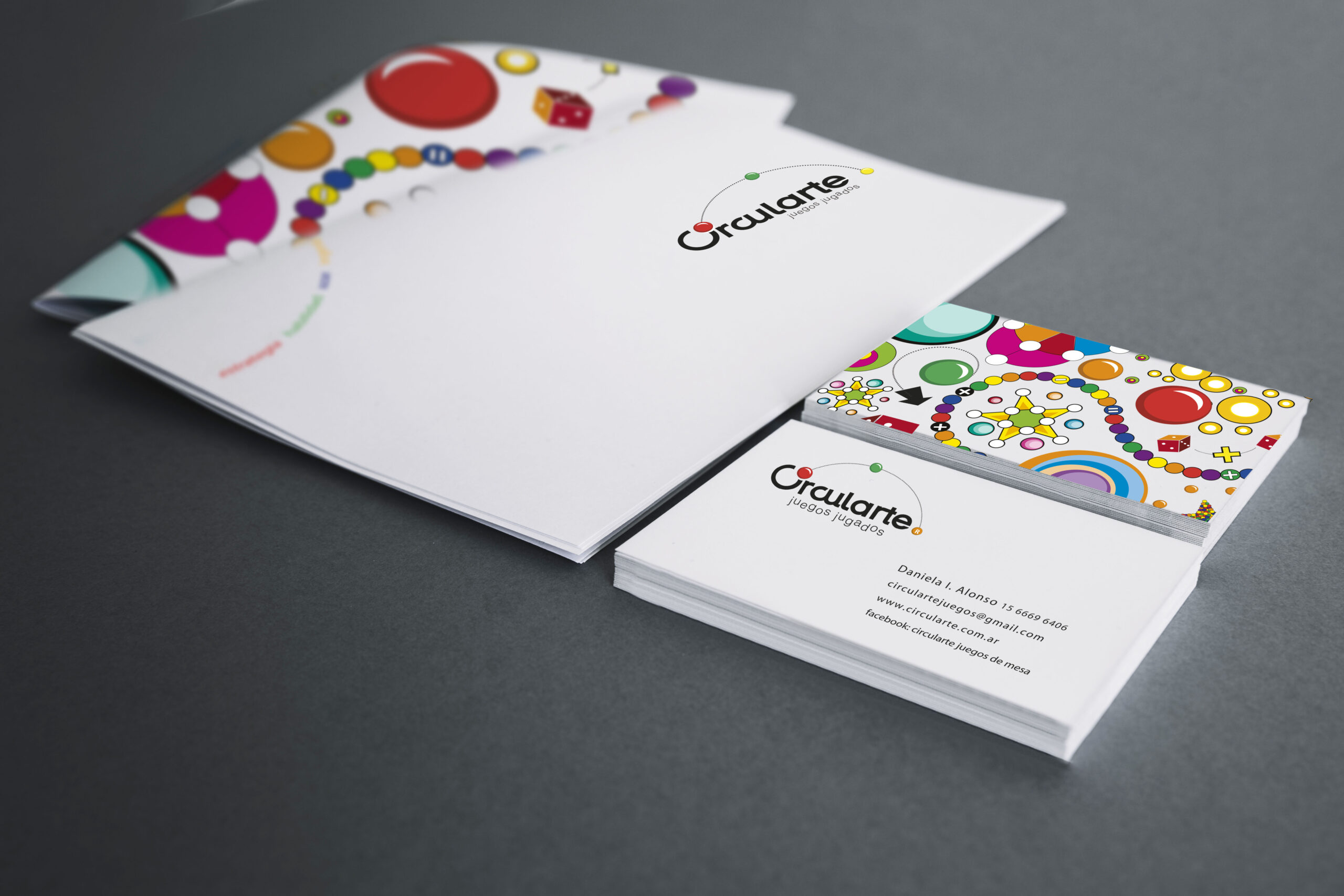
We developed the visual identity and packaging system for Circularte: Juegos Jugados. The graphic concept is born from the language of play itself: color, pause and respect for the handmade. The logo and its palette of primary tones radiate vitality, while the bold typography provides a playful yet solid structure.
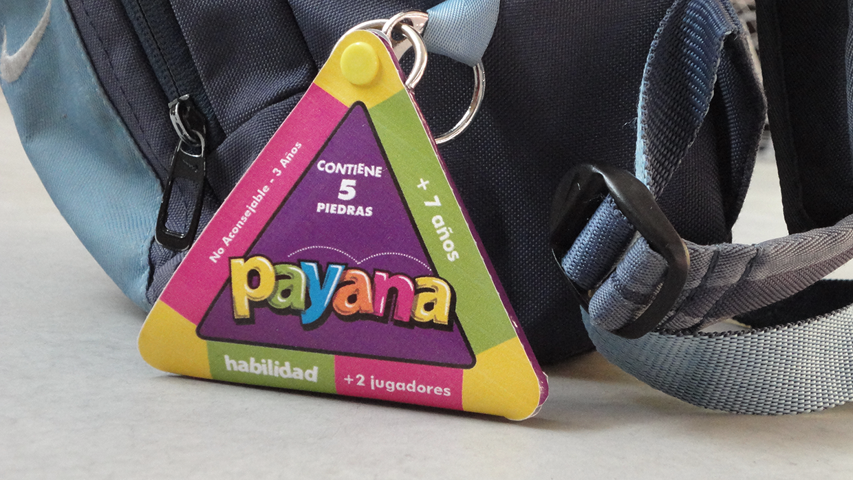
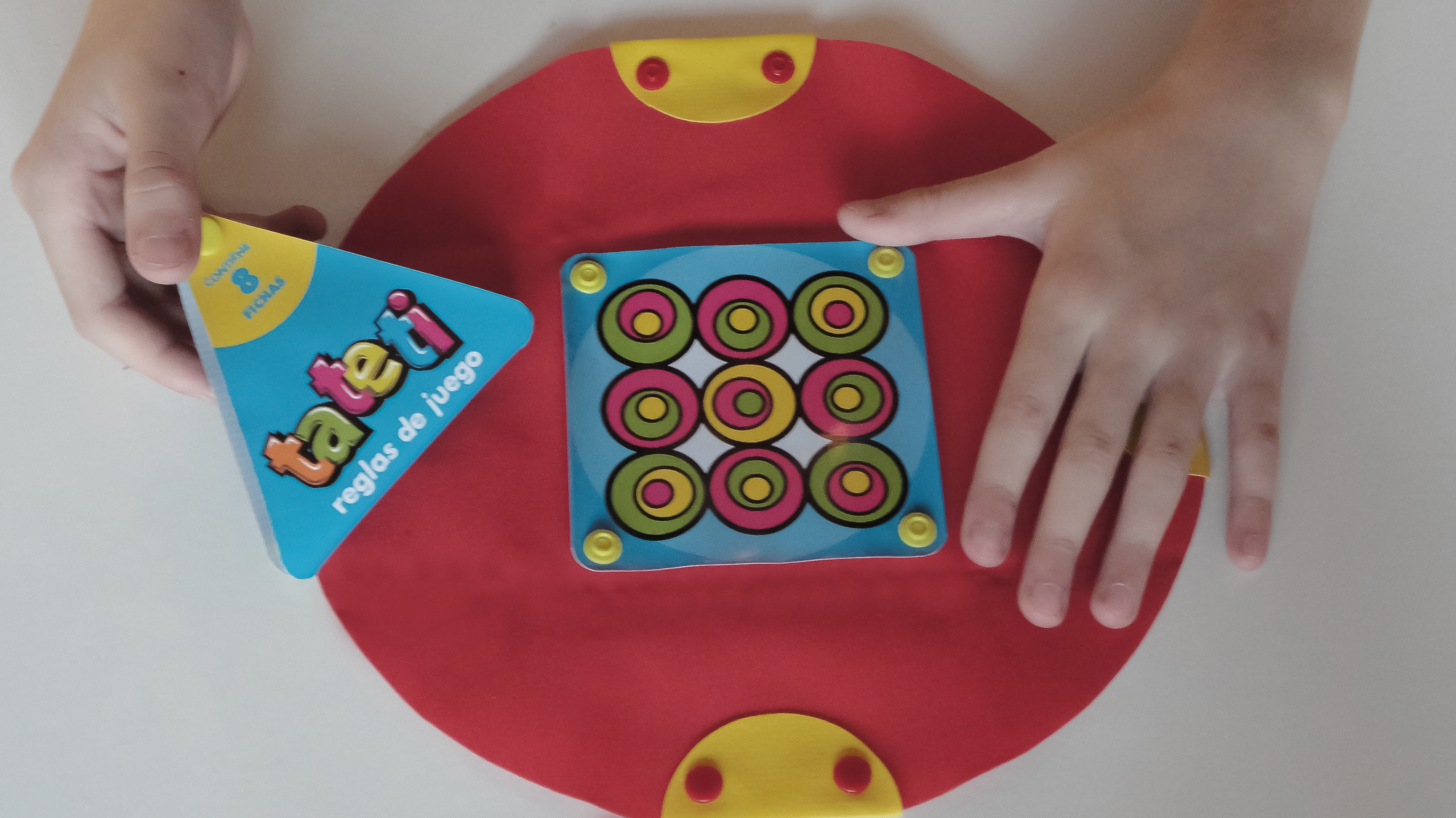
The central symbol, a circular stroke, evokes the sacred space that forms around the table when a game begins. The packaging design is not only fun to look at but also functional and ergonomic, made to be carried easily. Circularte is not just a games brand; it is an invitation to inhabit the present and enjoy real connection through play.
Sorry, the comment form is closed at this time.